Friday, December 7, 2012


Game Drawings in Perspective Critique 


       I really like how my piece turned out because I painted the water color using washes a little to darkly so I'm glad to lighter highlights and colored pencils show through.  I used perspective in the piece so it looked more realistic, but that part of this assignment didn't turn out well at all.  I also made a mistake by using colored pencil before I water colored so the overlapping was different in areas and the whole piece wasn't as consistent as I wanted it to be.  I was glad that the left hand side of my composition showed value that I represented by blending different colors that compliment each other together.  I didn't add shadows that well in this painting.  I also used vanishing points on the horizon to complete the perspective component.  I showed gradation on the top right hand side square where it is dark green to light green.  This reflected my skills with value.  The hardest part for me was the drawing of the animal and completing the whole piece in perspective.  I learned a lot from this piece one being always follow instructions and I'd rather be safe than sorry.

Sunday, November 18, 2012


Anamorphosis Critique

Word Bank: Use these vocabulary words in your responses. Please underline ormake letters bold when you use them. 

Grid       colored pencils anamorphosis                 photoshop        transform         scale
Perspective      shadows             value                    

               
1. Describe the process you went through to change your object into the correct perspective to create the drawing. This is when you were in the lab.
In the lab we opened photoshop and transformed our photo to the correct perspective so the photo was on a different scale.

2. How did distorting and stretching the object allow for you to create a drawing that would look different to the viewer?
Stretching the image allowed the viewer to see the 2-D drawing as if it was standing up.  Adding a shadow also helped this view to occur.

3. What were the most important concepts in the project to make it successful?
First I had to set up a grid to match up each little square so it was exact with the distorted picture.  I then used color pencils anamorphosis to add different values to a solid color.  So instead of red I used red, orange, purple, brown and yellow.  

Famous Landmark or Transportation Stencil Critique

Word Bank: Use these vocabulary words in your responses. Please underline or make letters bold when you use them. 

Stencil                 Spray Paint       Xacto Knife        Positive/Negative Space
Composition    Collage                Photoshop        Threshold              Contrast

1. Explain how you changed your photo in the lab to create a stencil.
In the lab we used Photoshop to change the threshold of the photo.  Then we had to saturate the threshold to what we wanted in the means of contrast of the black and white.  This was done to make the stencil.

2. When creating the collage background explain your choices of colors, materials (magazine paper, books pages, etc), and placement. How does it relate to your topic? If no relation discuss general idea.
When completing my background collage I wanted it to be bright and multicolored and no much texture.  I did so because my photo was of a soldier and tank so I wanted the stencil to really stand out against the background.  I used newspaper for the background, however it did not add much to the texture.  The overall composition of the background make the stencil really shown.

3. Discuss the way positive and negative space was used to create your stencil.
The positive and negative spaces I used to create the stencil was pretty difficult.  I cut out the black parts because I wanted the negative space to be colorful.  I also wanted the negative space/shadow to be visible.

4. When using the xacto knife, explain the safety procedures, how to use the knife and any challenges you had to overcome while cutting.
I had no challenges using the xacto knife besides getting it to cut little lines.  The safety procedures are basically to cut away from yourself and not to fool around so your don't danger yourself or others.  

5. How was your experience with the spray paint? Discuss how color choice is important, placement of stencil, and any other concepts you noticed while creating this. 

My experience with spray paint was fun.  I loved how it smelled.  Overall it wasn't complicated and really added to the whole composition in a fun way.  The color choice was just fun and bright.  The placement of the stencil had to be precise so the Spray painting of it was correct.

Monday, October 22, 2012

PRINTMAKING

SELF EVALUATION


1.     Describe the overall composition of your artwork (balance, unity, rhythm and movement).
I think the overall composition of my work was great.  The balance of dark and light made the piece more realistic and showed the owl in its best form.  I added movement by the lines in the background, so the sky wasn't bland and clear.
  
2.     How did you add texture and contrast to your print? Is this important? Why?
I added texture by the light indents in the clouds and lines in the face.  The lines in the wings also showed movement and looked like feathers.  Contrast was shown in the lightness of the face, darkness of wings, and darkness in clouds as well as the lightness of the sky.  Contrast is important in a piece because it shows all the little details and make the object more realistic.
3.     Explain how you used positive and negative space to show your image.
I used positive and negative space by the lines in the sky and surrounding the owl.  The positive space contrasted with the negative space.  The negative space added extra details to the movement and fluidity of the work.

4.     Describe the craftsmanship of your print. (How good the project is technically crafted)
I think the craftsmanship of my print was great.  There were a few mistakes and some parts of the owl could have been cleaner.  I was really pleased on how my print turned out.

5.     Were you able to achieve depth by showing a foreground, middle ground and back- ground? Explain.
I was able to achieve depth by showing a cloud, sun, and the owl.  I did this because the sun was smaller and in the corner so it showed the sun was far away and that the owl was very close to the cloud.

6.     Explain your experience with Printmaking. What were the obstacles and advantages?
My experience with printmaking was easy in the parts of drawing the owl and the surroundings.  It was hard to cut the linoleum in very small spaces.  The printing was an obstacle because if you didn't hold it down long enough it would not fully cover the ink and the composition would look incomplete.

Thursday, October 4, 2012

PRINT SKETCH CRITIQUE


Print Sketch Critique

1. Why is texture so important to have in your sketches?
Texture is crucial in sketches.  With the sketch having no color you have to show the value of what you are representing.  You do this by shading and texture.  It makes the drawing very detailed and more realistic.
2. Why is it necessary for you to have several references of each animal and each background? Explain.
This is important (to have several references) because if you just draw from one perspective then you don't get all the details you could get from other sources.  It makes the sketch more realistic.
3. When you look at your sketches are you able to see which sketch is the strongest and will make the best print? How do you know this? 
I can tell by looking at my sketches which one is the strongest by how detailed it is and if it looks real.  The best print will be discovered when I start trying out compositions and that will be found when I see which animal looks the best with the surroundings.

Chalk Mural Critique
                                                                                                                                                        
Self evaluation (must write at least 3 sentences for each question)
1. Explain your experience working on a team and executing your ideas for the mural.
My experience working with on a team was great because four of the five people I worked with each completed what they needed to effectively finish the assignment.  What was great is I also had fun with my teamates.  For the mural we started with making ten thumbnails or ideas for our actual chalk creation.  Then each of us voted for our two which we all continued to draw in our sketchbooks.  We then decided which one would be the easiest to execute and the most interactive.  That was how we ended up with the finished idea for the mural.
2. Explain the importance of collaboration when working on a team.
 Collaboration when working on a team is essential.  This is true because everyone needs to be involved and the overall decisions need to be compromised so everyone is pleased.  When more than one person are working together it can be easier in the sense that you get more work done faster, but also you need more people to agree to one thing that suits everyones needs.
3.  How successful was this project? Explain how and why.
I believe that of course this project could be better and it can always be improved, although I think this project was successful.  We finished the mural when it was due and looked like I had imagined.  Overall their were things that could have been completed differently, but it fit the criteria we were asked to include except for outlining in black.
4. Explain how you feel about creating artwork that others can interact with. Ex. Invoving the whole school? 
I feel really involved in my school when I helped complete a mural that other students at Apex High can walk by and picture themselves in it.  I like knowing that there is a piece of me on the walls of the school.  I also enjoy seeing people relate to my work.

Thursday, September 20, 2012

Value Portraits Art Critique

 
Value Portraits Art Critique

                                                                                                                                                        
Self evaluation (must write at least 3 sentences for each question)

1. Explain the process you went through to develop your drawing.
First I picked a picture of Noah off the board and placed a sheet of wax paper over it.  I then proceeded to look for all the values in the picture.  Basically the light and the dark of the picture.  After that was completed I shaded darkly the back of the wax paper and then copied it into my notebook where I started on the shading and final touches of the portrait.
2. Explain how you found the different values in the portrait?
I found the different values in the portrait by placing the picture with the wax paper on the window.  In which the sunlight shown through and made it much easier to find the values.  That is how I found the values in the portrait.
3.  Did you achieve a full range of the different values within your portrait?  How?
I believe that I DID achieve a full range of different values within my portrait.  How I did it? I did by using the wax paper and finding different zones of value which I transferred in my sketchbook and shaded it to blend.
4. Describe your craftsmanship.  Is the artwork executed and crafted neatly?
I think my artwork is crafted neatly by how effectively I used my time.  Also how hard I worked to blend
the values together.  My craftsmanship is very delicate and fragile, I showed my values very well and executed the blending excellently.
5. List any obstacles you had to overcome and how you dealt with them.
An obstacle I had to overcome was when transferring the portrait to the sketchbook.  It looked like a MONSTER so I shaded and shaded and blended until it actually looked human again.  It was hard but I am proud of my finished work.

Friday, September 7, 2012

1. Describe your overall thoughts on the final piece.
My overall thoughts on my final piece was that I thought I did good although I didn't fully grasp the shading and blending aspect of working with pastels.  I also did not put the shapes on the right planes and made it look as if the cone was floating, which is not humanly possible.  I want to do better next time.
2. if this was a group project, what was your contribution?
My contribution would be picking the color schemes and drawing the shapes as well as blending the cone.
3. How successful do you feel this piece is and why?
I feel this piece is successful because even though it's not perfect I tried really hard and in the end it showed good work and quality.
4. What worked about this project? What didn’t work?
What worked is the cone and the sphere and the background.  What didn't work was the cube and my cone looked as if it was floating.
5. If you were to do this project over again, what changes would you consider making?
I would make sure the cone was in the right place and it all looked wonderful.
6. What was the most difficult part about completing this piece and why?
The blending of the colors because it took a great eye for color to know exactly how to pull it off.
7. What did you learn from this piece?
Art is not as easy as I thought and many things have to work out to finish effectively.
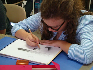
This is me completing a value scale effectively.  (-;